Skalierbare Design Systems: Von der Theorie zur Praxis
10. Dezember 2024
12 min
Lukas Ernst
Design
Skalierbare Design Systems: Vonder Theorie zur Praxis
10. Dezember 2024
12 min
Lukas Ernst
Ein gut durchdachtes Design System ist mehr als nur eine Sammlung von UI-Komponenten. Es ist das Fundament für konsistente, skalierbare und wartbare Benutzeroberflächen, die Teams dabei helfen, effizienter zu arbeiten und bessere Produkte zu entwickeln.
Ein Design System ist eine umfassende Sammlung von wiederverwendbaren Komponenten, geleitet von klaren Standards, die zusammengefügt werden können, um jede Anzahl von Anwendungen zu erstellen.
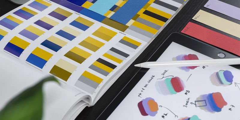
Design Tokens - Die atomaren Einheiten des Designs
Component Library - Wiederverwendbare UI-Komponenten
Documentation - Richtlinien und Best Practices
Patterns - Häufig verwendete UI-Muster
Tools - Design- und Entwicklungstools
Design Tokens sind die kleinsten Design-Entscheidungen, die als Data gespeichert werden. Sie bilden das Fundament eines jeden Design Systems.
/* Global Tokens */
:root {
  /* Colors */
  --color-primary-50: #eff6ff;
  --color-primary-100: #dbeafe;
  --color-primary-500: #3b82f6;
  --color-primary-900: #1e3a8a;

  /* Typography */
  --font-family-sans: 'Inter', system-ui, sans-serif;
  --font-size-xs: 0.75rem;
  --font-size-sm: 0.875rem;
  --font-size-base: 1rem;
  --font-size-lg: 1.125rem;
  --font-size-xl: 1.25rem;

  /* Spacing */
  --spacing-1: 0.25rem;
  --spacing-2: 0.5rem;
  --spacing-4: 1rem;
  --spacing-8: 2rem;
  --spacing-16: 4rem;

  /* Shadows */
  --shadow-sm: 0 1px 2px 0 rgb(0 0 0 / 0.05);
  --shadow-md: 0 4px 6px -1px rgb(0 0 0 / 0.1);
  --shadow-lg: 0 10px 15px -3px rgb(0 0 0 / 0.1);

  /* Border Radius */
  --radius-sm: 0.125rem;
  --radius-md: 0.375rem;
  --radius-lg: 0.5rem;
  --radius-xl: 0.75rem;
}

/* Semantic Tokens */
:root {
  --color-text-primary: var(--color-gray-900);
  --color-text-secondary: var(--color-gray-600);
  --color-text-muted: var(--color-gray-500);

  --color-bg-primary: var(--color-white);
  --color-bg-secondary: var(--color-gray-50);
  --color-bg-muted: var(--color-gray-100);

  --color-border-default: var(--color-gray-200);
  --color-border-muted: var(--color-gray-100);
}
// build.js
const StyleDictionary = require('style-dictionary')

StyleDictionary.extend({
  source: ['tokens/**/*.json'],
  platforms: {
    scss: {
      transformGroup: 'scss',
      buildPath: 'build/scss/',
      files: [
        {
          destination: '_variables.scss',
          format: 'scss/variables',
        },
      ],
    },
    js: {
      transformGroup: 'js',
      buildPath: 'build/js/',
      files: [
        {
          destination: 'tokens.js',
          format: 'javascript/es6',
        },
      ],
    },
  },
}).buildAllPlatforms()
Das Atomic Design von Brad Frost bietet einen systematischen Ansatz:
Die kleinsten Bausteine:
// Button Atom
interface ButtonProps {
  variant: 'primary' | 'secondary' | 'outline' | 'ghost'
  size: 'xs' | 'sm' | 'md' | 'lg' | 'xl'
  children: React.ReactNode
  disabled?: boolean
  loading?: boolean
  onClick?: () => void
}

export const Button: React.FC<ButtonProps> = ({
  variant = 'primary',
  size = 'md',
  children,
  disabled = false,
  loading = false,
  onClick,
}) => {
  const baseClasses = [
    'inline-flex',
    'items-center',
    'justify-center',
    'font-medium',
    'rounded-md',
    'transition-colors',
    'focus:outline-none',
    'focus:ring-2',
    'focus:ring-offset-2',
  ]

  const variantClasses = {
    primary: ['bg-blue-600', 'text-white', 'hover:bg-blue-700', 'focus:ring-blue-500'],
    secondary: ['bg-gray-100', 'text-gray-900', 'hover:bg-gray-200', 'focus:ring-gray-500'],
    outline: ['border', 'border-gray-300', 'bg-white', 'text-gray-700', 'hover:bg-gray-50', 'focus:ring-blue-500'],
    ghost: ['text-gray-700', 'hover:bg-gray-100', 'focus:ring-gray-500'],
  }

  const sizeClasses = {
    xs: ['px-2', 'py-1', 'text-xs'],
    sm: ['px-3', 'py-1.5', 'text-sm'],
    md: ['px-4', 'py-2', 'text-sm'],
    lg: ['px-4', 'py-2', 'text-base'],
    xl: ['px-6', 'py-3', 'text-base'],
  }

  const classes = [
    ...baseClasses,
    ...variantClasses[variant],
    ...sizeClasses[size],
    disabled && 'opacity-50 cursor-not-allowed',
  ]
    .filter(Boolean)
    .join(' ')

  return (
    <button
      className={classes}
      disabled={disabled || loading}
      onClick={onClick}
    >
      {loading && (
        <svg
          className="animate-spin -ml-1 mr-2 h-4 w-4"
          fill="none"
          viewBox="0 0 24 24"
        >
          <circle
            cx="12"
            cy="12"
            r="10"
            stroke="currentColor"
            strokeWidth="4"
            className="opacity-25"
          />
          <path
            fill="currentColor"
            className="opacity-75"
            d="m4 12a8 8 0 018-8V0C5.373 0 0 5.373 0 12h4zm2 5.291A7.962 7.962 0 014 12H0c0 3.042 1.135 5.824 3 7.938l3-2.647z"
          />
        </svg>
      )}
      {children}
    </button>
  )
}
Kombinationen von Atomen:
// Search Input Molecule
interface SearchInputProps {
  placeholder?: string
  value: string
  onChange: (value: string) => void
  onSubmit?: () => void
  loading?: boolean
}

export const SearchInput: React.FC<SearchInputProps> = ({
  placeholder = 'Search...',
  value,
  onChange,
  onSubmit,
  loading = false,
}) => {
  return (
    <div className="relative">
      <input
        type="text"
        className="block w-full pl-10 pr-12 py-2 border border-gray-300 rounded-md leading-5 bg-white placeholder-gray-500 focus:outline-none focus:placeholder-gray-400 focus:ring-1 focus:ring-blue-500 focus:border-blue-500"
        placeholder={placeholder}
        value={value}
        onChange={(e) => onChange(e.target.value)}
        onKeyPress={(e) => e.key === 'Enter' && onSubmit?.()}
      />
      <div className="absolute inset-y-0 left-0 pl-3 flex items-center pointer-events-none">
        <SearchIcon className="h-5 w-5 text-gray-400" />
      </div>
      <div className="absolute inset-y-0 right-0 pr-3 flex items-center">
        <Button
          variant="ghost"
          size="sm"
          onClick={onSubmit}
          loading={loading}
        >
          Search
        </Button>
      </div>
    </div>
  )
}
Komplexe UI-Abschnitte:
// Navigation Organism
interface NavigationItem {
  label: string
  href: string
  icon?: React.ComponentType<{ className?: string }>
  active?: boolean
}

interface NavigationProps {
  items: NavigationItem[]
  logo?: React.ReactNode
  user?: {
    name: string
    avatar: string
  }
  onLogout?: () => void
}

export const Navigation: React.FC<NavigationProps> = ({ items, logo, user, onLogout }) => {
  return (
    <nav className="bg-white shadow-sm border-b border-gray-200">
      <div className="max-w-7xl mx-auto px-4 sm:px-6 lg:px-8">
        <div className="flex justify-between h-16">
          <div className="flex items-center">
            {logo && <div className="flex-shrink-0 mr-8">{logo}</div>}
            <div className="hidden md:block">
              <div className="ml-10 flex items-baseline space-x-4">
                {items.map((item) => (
                  <a
                    key={item.href}
                    href={item.href}
                    className={`px-3 py-2 rounded-md text-sm font-medium transition-colors ${
                      item.active ? 'text-blue-600 bg-blue-50' : 'text-gray-600 hover:text-gray-900 hover:bg-gray-50'
                    }`}
                  >
                    <div className="flex items-center space-x-2">
                      {item.icon && <item.icon className="h-4 w-4" />}
                      <span>{item.label}</span>
                    </div>
                  </a>
                ))}
              </div>
            </div>
          </div>

          {user && (
            <div className="flex items-center space-x-4">
              <div className="flex items-center space-x-3">
                <img
                  className="h-8 w-8 rounded-full"
                  src={user.avatar}
                  alt={user.name}
                />
                <span className="text-sm font-medium text-gray-700">{user.name}</span>
              </div>
              <Button
                variant="outline"
                size="sm"
                onClick={onLogout}
              >
                Logout
              </Button>
            </div>
          )}
        </div>
      </div>
    </nav>
  )
}
// Button.stories.tsx
import type { Meta, StoryObj } from '@storybook/react'
import { Button } from './Button'

const meta: Meta<typeof Button> = {
  title: 'Components/Button',
  component: Button,
  parameters: {
    layout: 'centered',
    docs: {
      description: {
        component: 'A versatile button component with multiple variants and sizes.',
      },
    },
  },
  argTypes: {
    variant: {
      control: { type: 'select' },
      options: ['primary', 'secondary', 'outline', 'ghost'],
      description: 'Visual style variant',
    },
    size: {
      control: { type: 'select' },
      options: ['xs', 'sm', 'md', 'lg', 'xl'],
      description: 'Size of the button',
    },
    disabled: {
      control: 'boolean',
      description: 'Disabled state',
    },
    loading: {
      control: 'boolean',
      description: 'Loading state with spinner',
    },
  },
}

export default meta
type Story = StoryObj<typeof meta>

export const Primary: Story = {
  args: {
    variant: 'primary',
    children: 'Primary Button',
  },
}

export const AllVariants: Story = {
  render: () => (
    <div className="space-x-4">
      <Button variant="primary">Primary</Button>
      <Button variant="secondary">Secondary</Button>
      <Button variant="outline">Outline</Button>
      <Button variant="ghost">Ghost</Button>
    </div>
  ),
}

export const AllSizes: Story = {
  render: () => (
    <div className="space-x-4 flex items-center">
      <Button size="xs">Extra Small</Button>
      <Button size="sm">Small</Button>
      <Button size="md">Medium</Button>
      <Button size="lg">Large</Button>
      <Button size="xl">Extra Large</Button>
    </div>
  ),
}
// Button.test.tsx
import { render, screen, fireEvent } from '@testing-library/react'
import { Button } from './Button'

describe('Button Component', () => {
  test('renders button with text', () => {
    render(<Button>Click me</Button>)
    expect(screen.getByRole('button', { name: /click me/i })).toBeInTheDocument()
  })

  test('handles click events', () => {
    const handleClick = jest.fn()
    render(<Button onClick={handleClick}>Click me</Button>)

    fireEvent.click(screen.getByRole('button'))
    expect(handleClick).toHaveBeenCalledTimes(1)
  })

  test('disables button when disabled prop is true', () => {
    render(<Button disabled>Click me</Button>)
    expect(screen.getByRole('button')).toBeDisabled()
  })

  test('shows loading state', () => {
    render(<Button loading>Click me</Button>)
    expect(screen.getByRole('button')).toBeDisabled()
    expect(screen.getByRole('button')).toHaveAttribute('aria-busy', 'true')
  })

  test('applies correct variant classes', () => {
    const { rerender } = render(<Button variant="primary">Primary</Button>)
    expect(screen.getByRole('button')).toHaveClass('bg-blue-600')

    rerender(<Button variant="secondary">Secondary</Button>)
    expect(screen.getByRole('button')).toHaveClass('bg-gray-100')
  })
})
# .github/workflows/chromatic.yml
name: Chromatic

on:
  push:
    branches: [main, develop]
  pull_request:
    branches: [main]

jobs:
  test:
    runs-on: ubuntu-latest
    steps:
      - uses: actions/checkout@v3
        with:
          fetch-depth: 0

      - name: Setup Node.js
        uses: actions/setup-node@v3
        with:
          node-version: '18'
          cache: 'npm'

      - name: Install dependencies
        run: npm ci

      - name: Run Chromatic
        uses: chromaui/action@v1
        with:
          token: ${{ secrets.GITHUB_TOKEN }}
          projectToken: ${{ secrets.CHROMATIC_PROJECT_TOKEN }}
Core Team - Wartung und Weiterentwicklung
Contributors - Feature-Entwicklung und Feedback
Consumers - Nutzer des Systems
// Migration Guide Beispiel
// v1 zu v2 Migration

// Before (v1)
<Button type="primary" size="large">
  Click me
</Button>

// After (v2)
<Button variant="primary" size="lg">
  Click me
</Button>

// Codemod für automatische Migration
npx @company/design-system-codemods v1-to-v2
{
  "name": "@company/design-system",
  "version": "2.1.0",
  "main": "dist/index.js",
  "types": "dist/index.d.ts",
  "files": ["dist", "README.md"],
  "peerDependencies": {
    "react": ">=16.8.0",
    "react-dom": ">=16.8.0"
  }
}
Adoption Rate - Prozentsatz der Teams, die das System nutzen
Component Usage - Häufigkeit der Nutzung einzelner Komponenten
Design Debt - Anzahl inkonsistenter UI-Patterns
Development Velocity - Zeit für UI-Feature-Entwicklung
Bug Rate - UI-bezogene Bugs pro Release
// Analytics Integration
import { track } from '@company/analytics'

export const Button: React.FC<ButtonProps> = (props) => {
  const handleClick = () => {
    track('design_system.button.click', {
      variant: props.variant,
      size: props.size,
      component_version: '2.1.0',
    })
    props.onClick?.()
  }

  // ... rest of component
}
Figma - Design und Prototyping
Tokens Studio - Token-Management in Figma
GitHub Actions - Automatisierte Token-Synchronisation
Storybook - Component Documentation
npm - Package Distribution
// design-tokens.yml
name: Design Tokens Sync

on:
  push:
    paths: ['design-tokens/**']

jobs:
  sync:
    runs-on: ubuntu-latest
    steps:
      - uses: actions/checkout@v3

      - name: Build tokens
        run: npm run build:tokens

      - name: Create PR with updated tokens
        uses: peter-evans/create-pull-request@v4
        with:
          token: ${{ secrets.GITHUB_TOKEN }}
          commit-message: 'Update design tokens'
          title: 'Auto: Update design tokens'
          body: 'Automated design token update from Figma'
Ein erfolgreiches Design System ist mehr als die Summe seiner Teile. Es erfordert:
Klare Governance und Ownership
Kontinuierliche Iteration basierend auf Nutzer-Feedback
Robuste Tooling für Design und Entwicklung
Umfassende Dokumentation und Onboarding
Kulturellen Wandel hin zu systematischem Design
Die Investition in ein gut durchdachtes Design System zahlt sich langfristig durch:
Reduzierte Entwicklungszeit für neue Features
Konsistente Benutzererfahrung über alle Produkte
Verbesserte Zusammenarbeit zwischen Design und Engineering
Skalierbare Design-Entscheidungen für wachsende Teams
Ein Design System ist nie "fertig" - es ist ein lebendiges, sich entwickelndes System, das mit den Bedürfnissen des Unternehmens und der Nutzer wächst.